Undercover
-
Постов
55 -
Зарегистрирован
-
Посещение
-
Победитель дней
2
Весь контент Undercover
-
Everyone knows most people shop on mobile. And a lot of sites have made their social sharing buttons trigger native apps like WhatsApp etc. I propose that Unitheme’s social share to either add additional common social apps or simply make it open a user’s social apps list so they can choose where to share. This is better than what we currently have - hard coded sites like X and Pinterest. Who is chatting on Pinterest anyway?
-
@ab.support.serhii Thanks for a prompt answer. Will you also include product images or its just fixes?
-
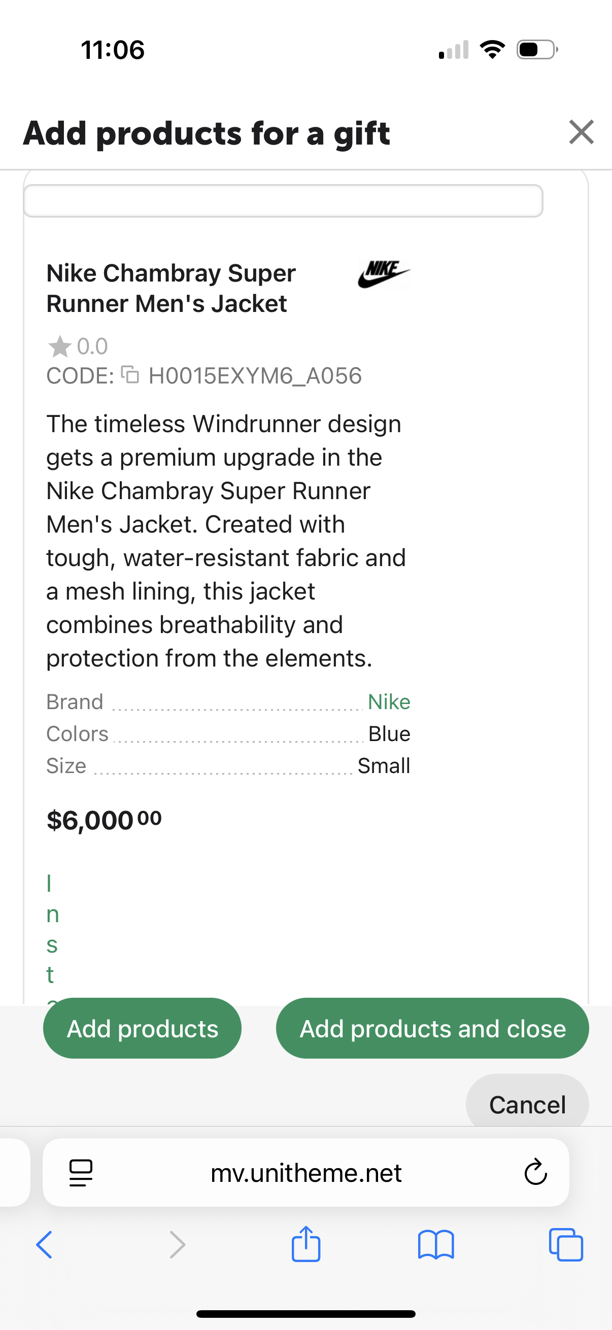
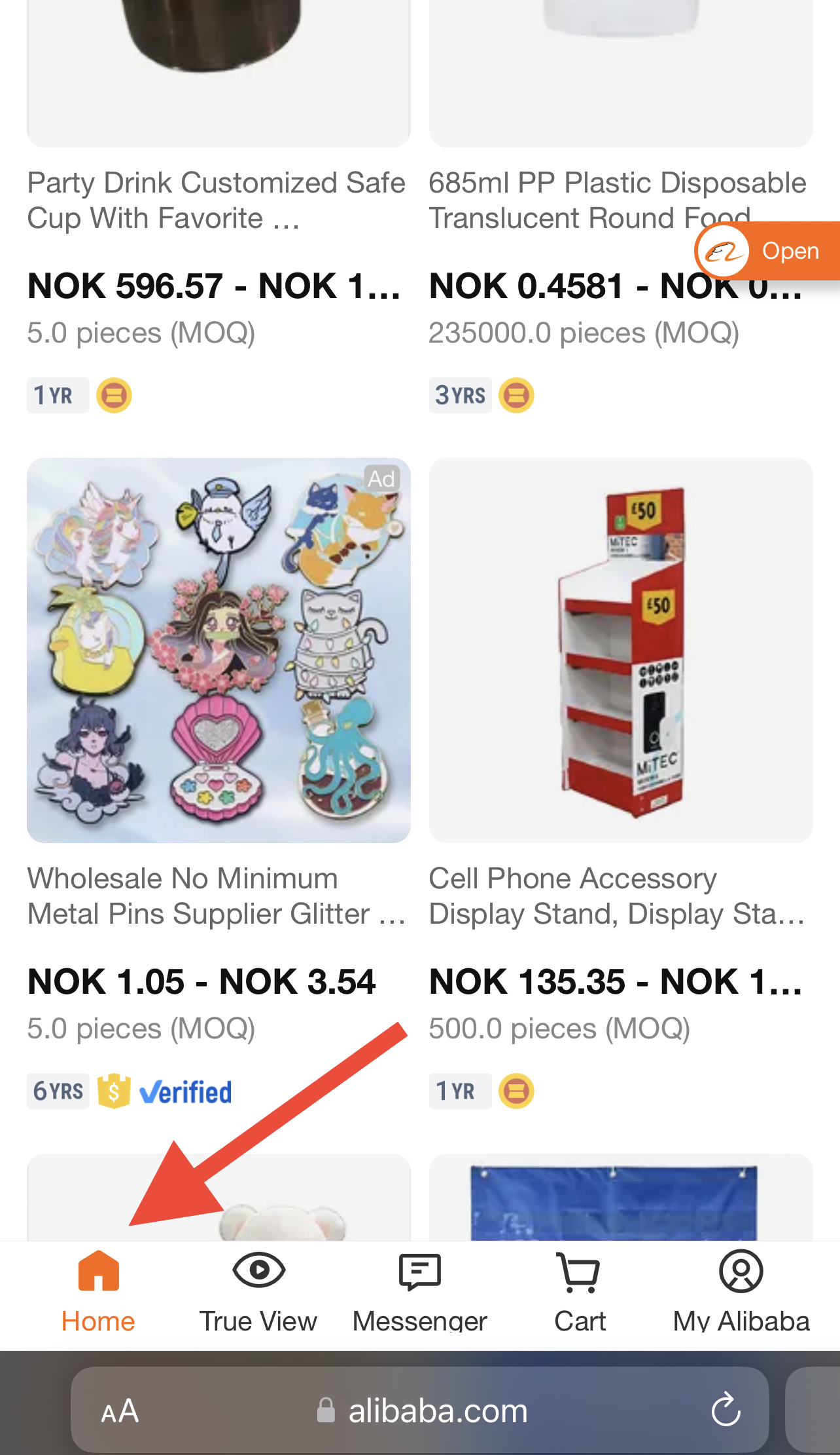
This site couldn't enable me select "Bugs" category so I am posting it here. The "Add products for certificates" has lots of bugs. - There is no product image - The select box goes from one corner to the other, instead of just a nice little checkbox - The stock availability is going vertically See attached screenshot on mobile These product cards should be clean and nicely organised. There is no need to waste space by showing product descriptions. Instead of showing product descriptions, just show a huge product image and some few features.

-
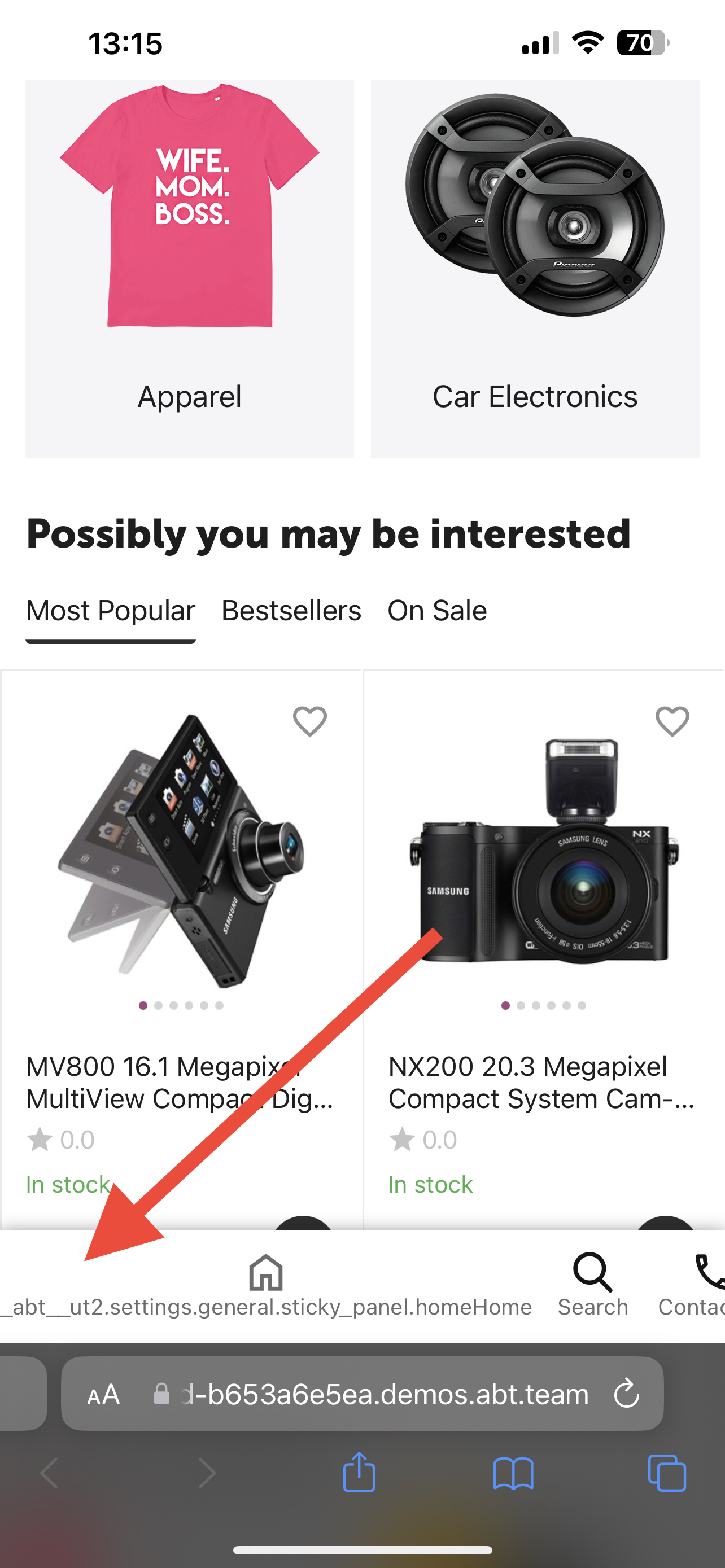
Also the same experience on PC (Safari).
-
This is what I see on your demo from my phone (Safari). Same experience.
-
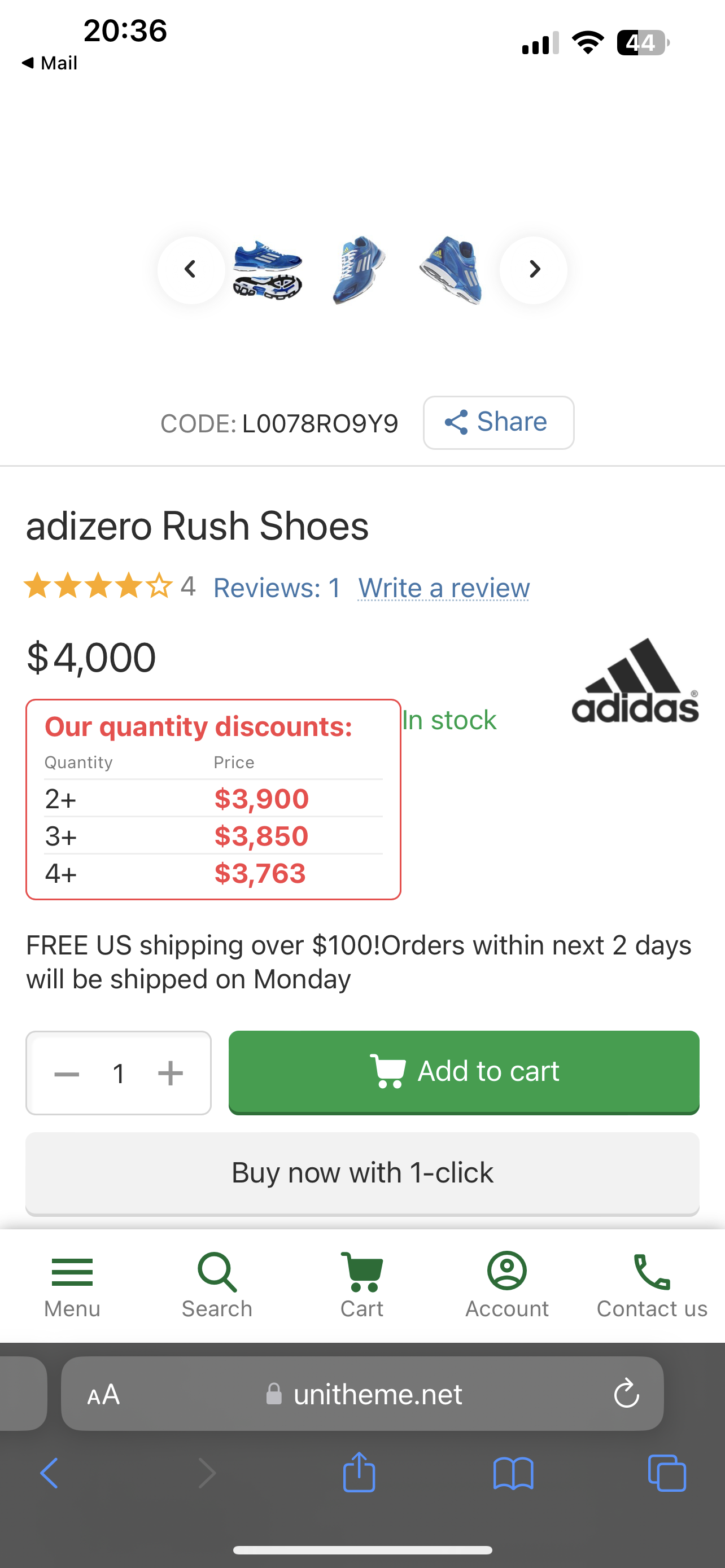
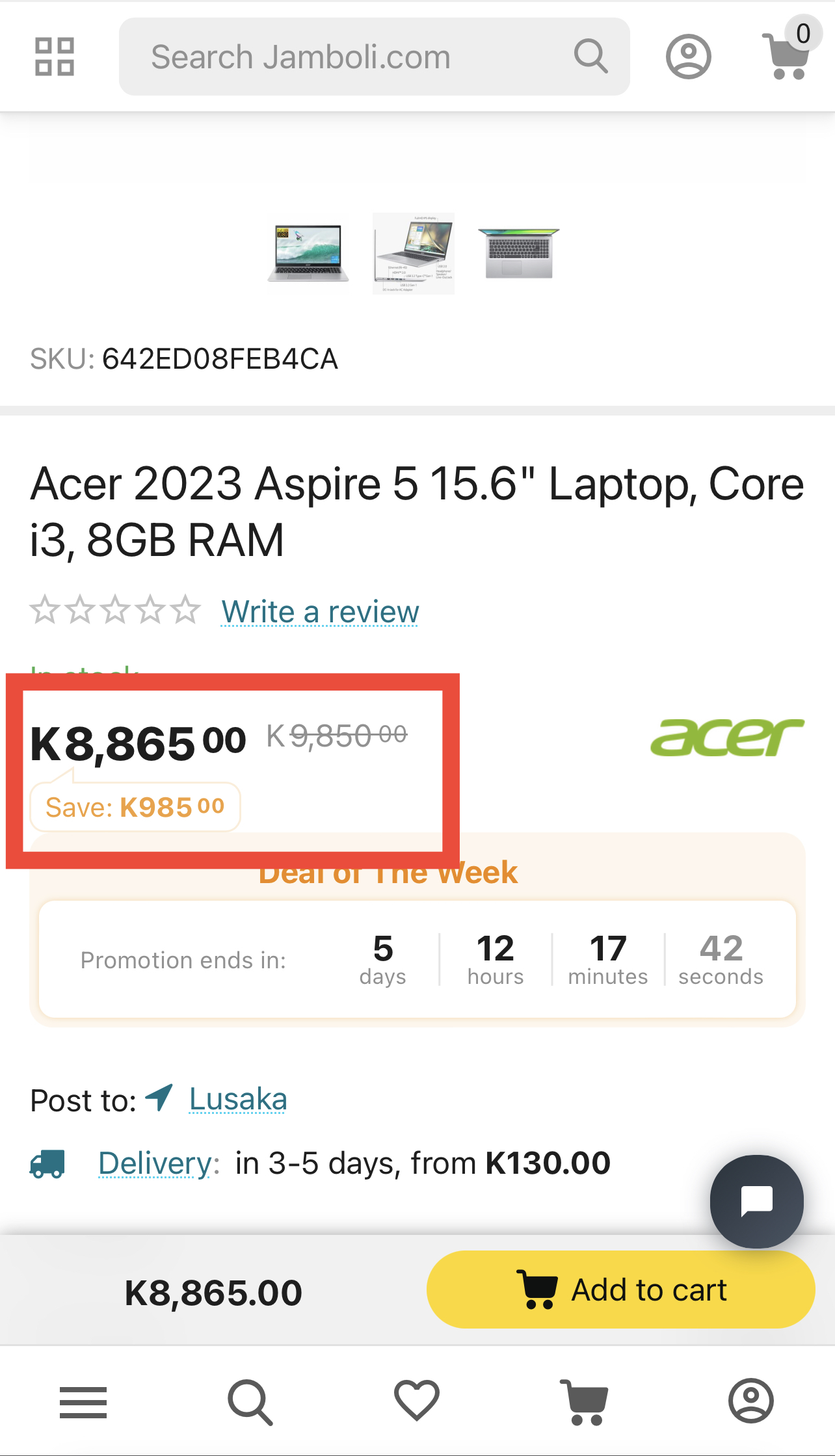
In newest Cs-cart when using advanced style the quantity discount is touching other elements. The “In stock” is displayed in the wrong place. See attached screenshot taken from mobile.
-
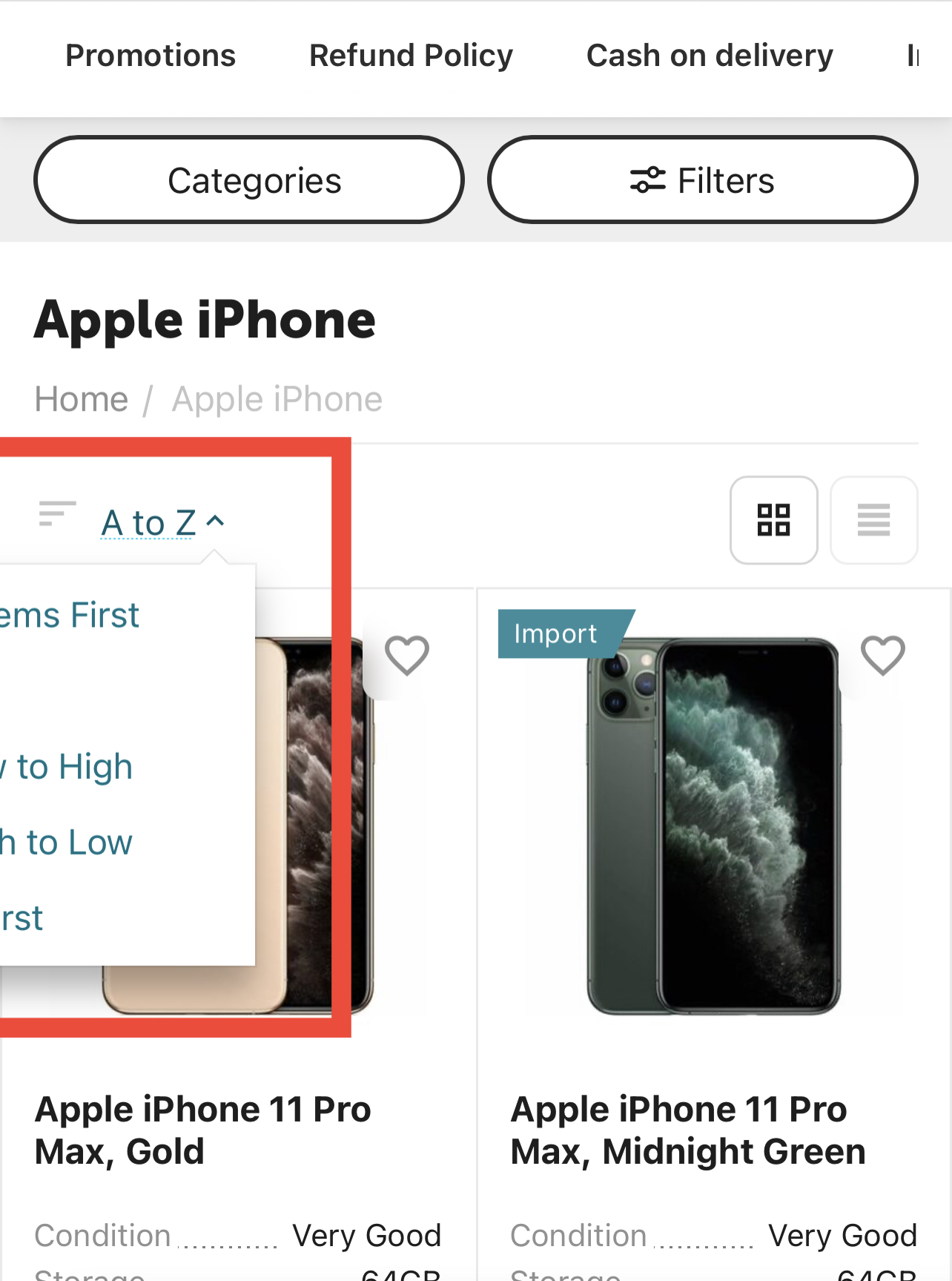
My filter is not displayed correctly and in spite of using fully rounded settings, the filter frames are not adhering to the rounded settings, they are using the default sharp corners. I checked the demo Unitheme and it works perfectly well there.
-
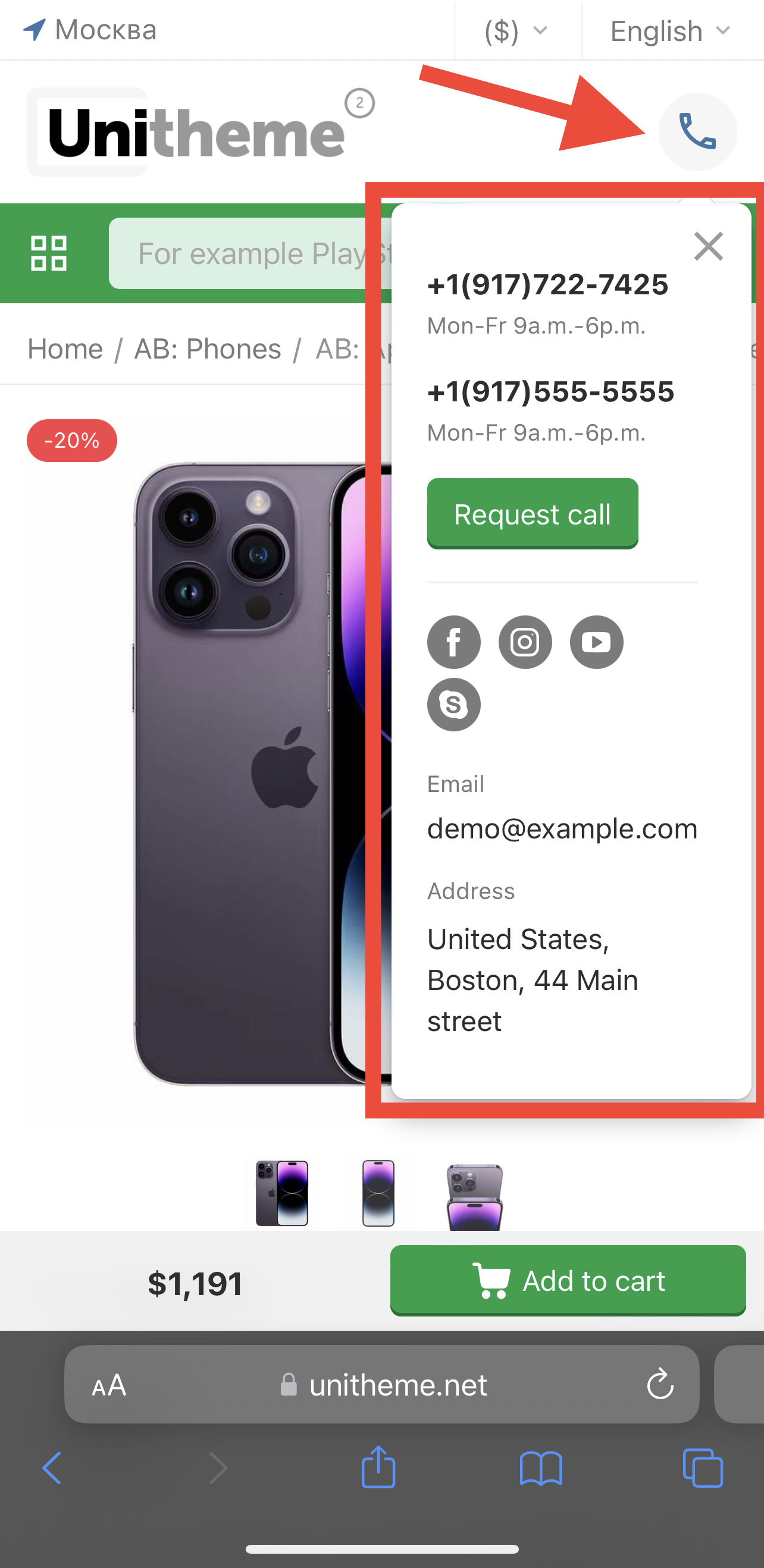
@ab.support.serj But there is a different colour shade that shows around the icon of the clicked active bottom sticky panel and it’s dark grey. That’s the only I want to change.
-
@ab.support.serj No I only want to change the colour of the border of the icon and title that indicates that the bottom panel link is clicked and active (being viewed).
-
@ab.support.serjthanks for that, that resolved it. How can I change the highlighted colour when a bottom sticky link is active? I am using advanced layout and white style and my decorative colour is #ff9900 in theme settings. Currently the bottom sticky panels when active they are highlighted with a dark grey which is difficult to distinguish from non-active links.
-
Thanks for the quick comment on this. What’s the appropriate translation that’s missing?
-
In advanced layout, enabled bottom sticky panel then enable “Link to Home Page”. If you turn on “Display titles for panel items” the icon of link to home page breaks. See attached screenshot.
-
Awesome to see all these many awesome changes and updates. Keep innovating, team AB!
-
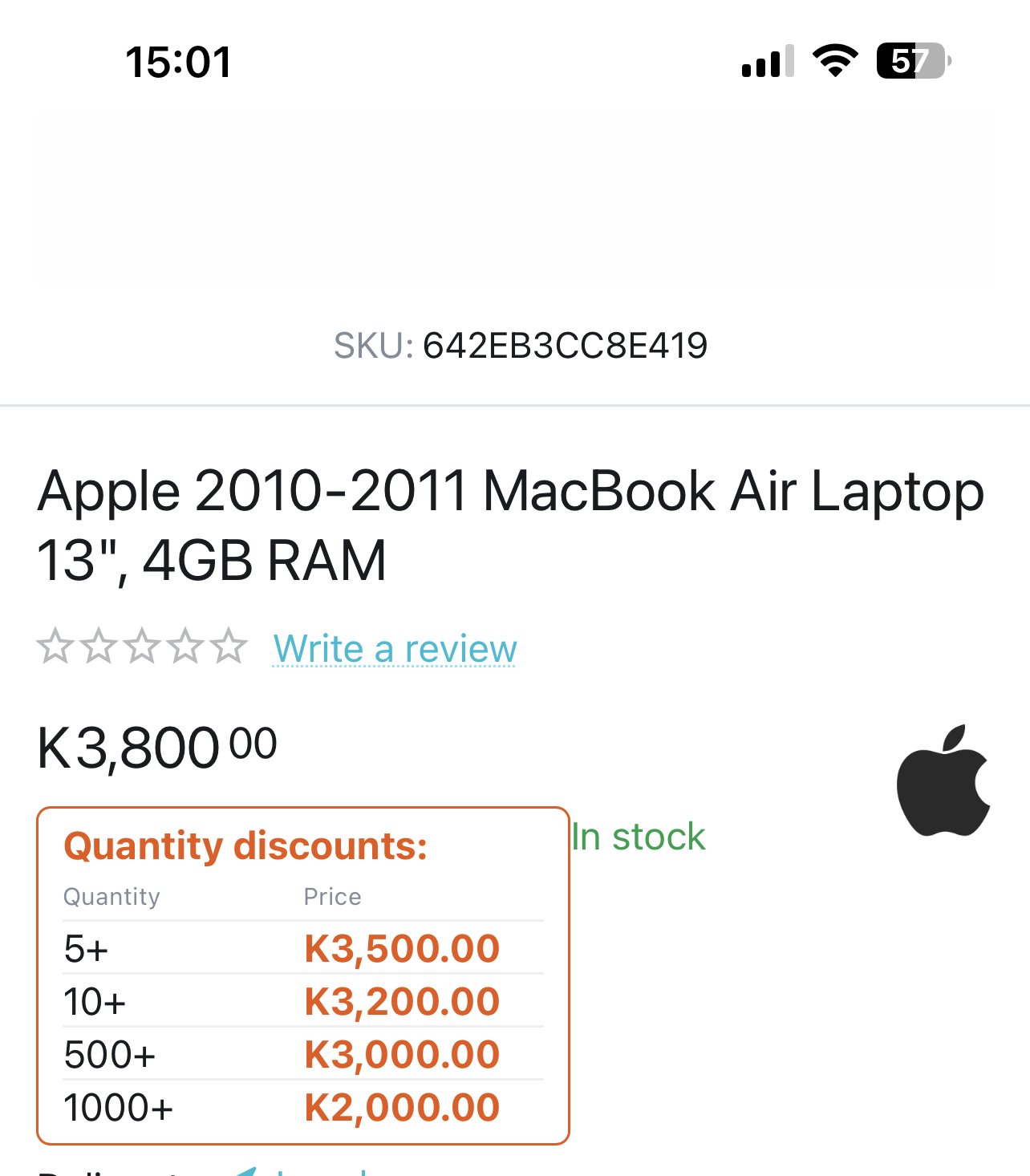
Can someone please explain why this is happening and how to resolve it. Updated to latest theme. Advanced layout and three columned product view. The “you save” price is touching other laments. See screenshot attached.
-
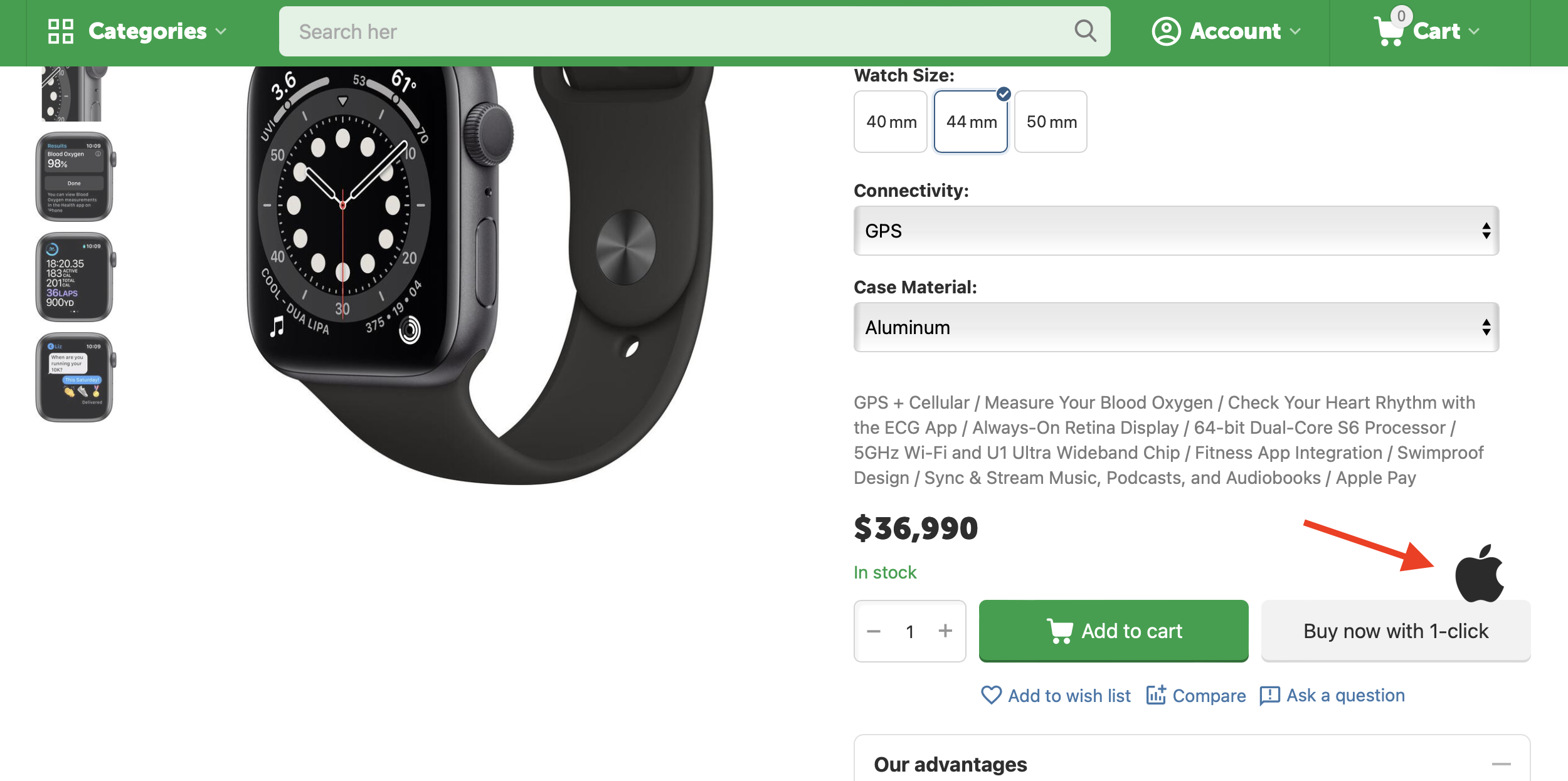
@alexbrandingIn the updated demo with advanced layout and three columned view, the brand is touching elements of the buy now with one click. See screenshot attached.
-
I understand that not all wishes can be met, but this particular feature has a lot of upvotes that was why I thought it would be featured in this release. Regarding paying for new features, it’s awesome that you have that option. But my problem is that a shop owner pays hundreds to a thousand dollars for a new feature because they want to differentiate themselves in a competitive market, then later that feature is pushed in a global update for everyone who paid zero. To tackle that issue I would propose a cloud fund for a high in demand complex feature. 1. Create a poll here to get votes 2. Move the request to a cloud funding platform. 3. Unitheme licence holders can fund the feature. 4. When funds reached then only those who contributed will have access to the addon . And If the goal hasn’t been reached then they get refunded.
-
So there are two category icons. One in the top header with a redesigned style: when I tap on it I see categories only. The second one is the menu in the bottom sticky with old style: when I click on that nothing happens. Is that what you guys are discussing?
-
So far in the demo I welcome these changes you’ve implemented. 1. Redesign of the contact tab in the header. When a user clicks on the phone icon the info is displayed nicely in a narrow block. Not too wide like before. * But was it necessary to add a light grey rounded colour to the icon? I would have preferred it the way it was before. 2. I welcome the blur under the heart icon when the image product extends behind it. 3. I welcome the mini thumbnails in mobile view. * But it’s difficult to tell which mini thumbnail is active because the fade on non-activated thumbnails is too faint. 4. Nothing dramatic has been done to the light scroller. I was hoping to see the ability to show features in the light scroller just like in the grid view. Since the product in grid view is just the same size as the light scroller it would have made sense if functionalities matched. 5. After a lot of people in this community asked for a “view all” text link that shows at the end of the heading of the featured collection, I was hoping to finally see it in this version. Right now all I see is the old “Now in demand” and nothing that says “view all”. This is really sad
-
Sorry but which 2 category buttons in the header? Which demo layout are you referring to?
-
I noticed that the demo site has some changes that I cant see in the current v4.16.2.a. Does that mean there is a new version? and if so then why cant I see it in my upgrade centre? I am currently on v4.16.2.a.
-
@ab.support.serjI’ve tried that one and it just looks like a very long vertical card taking up too much space and load time on mobile.
-
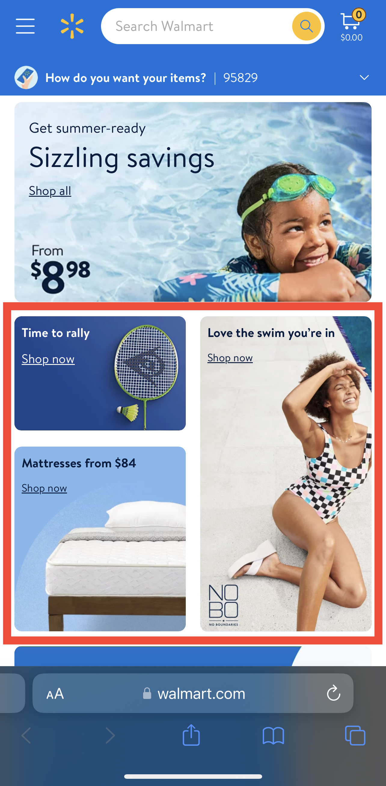
Surely other brands have managed to add similar banners to their “vertical mobile device”. 4 grid boxes style (already implemented in Unitheme) is okay, but not aesthetically pleasing.
-
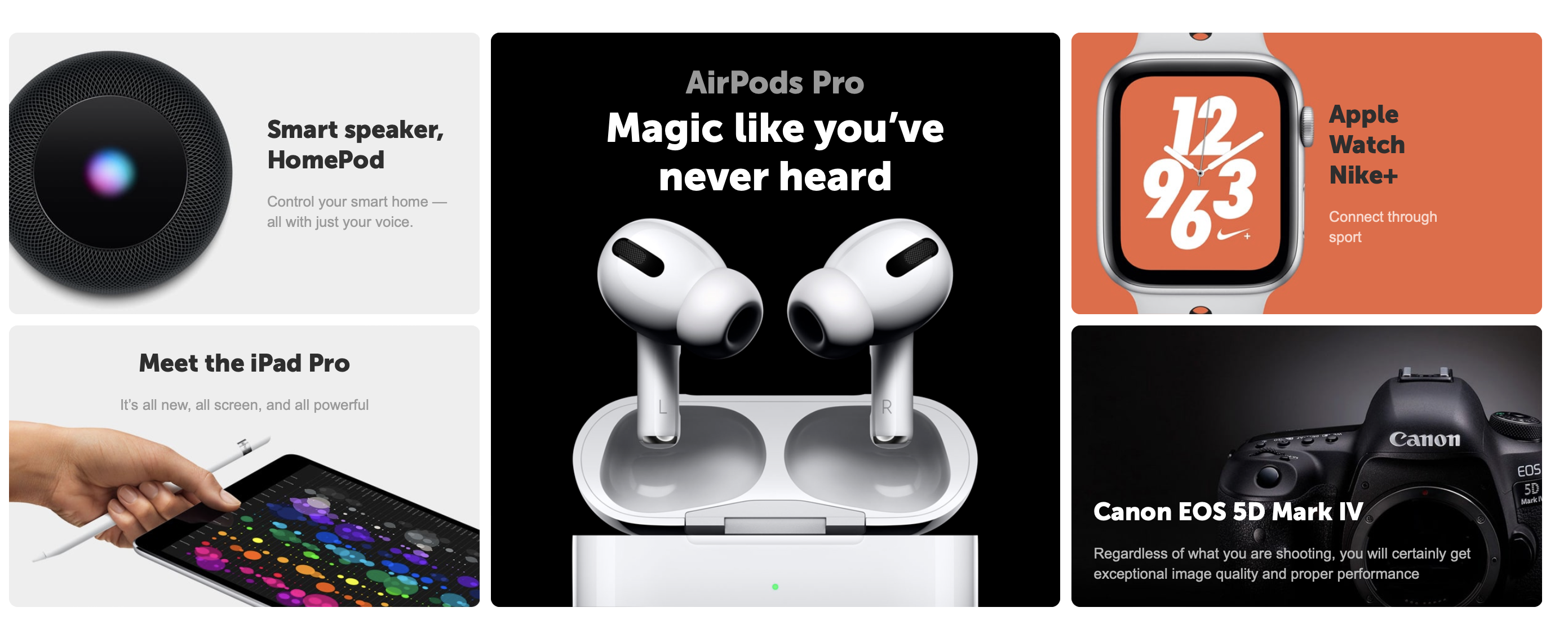
Unitheme is limited in banner styles especially on mobile. This style shown in the screenshot is good on desktop but it is only displayed vertically on mobile. It would be awesome to see such banners displayed just like that on mobile as well.
-
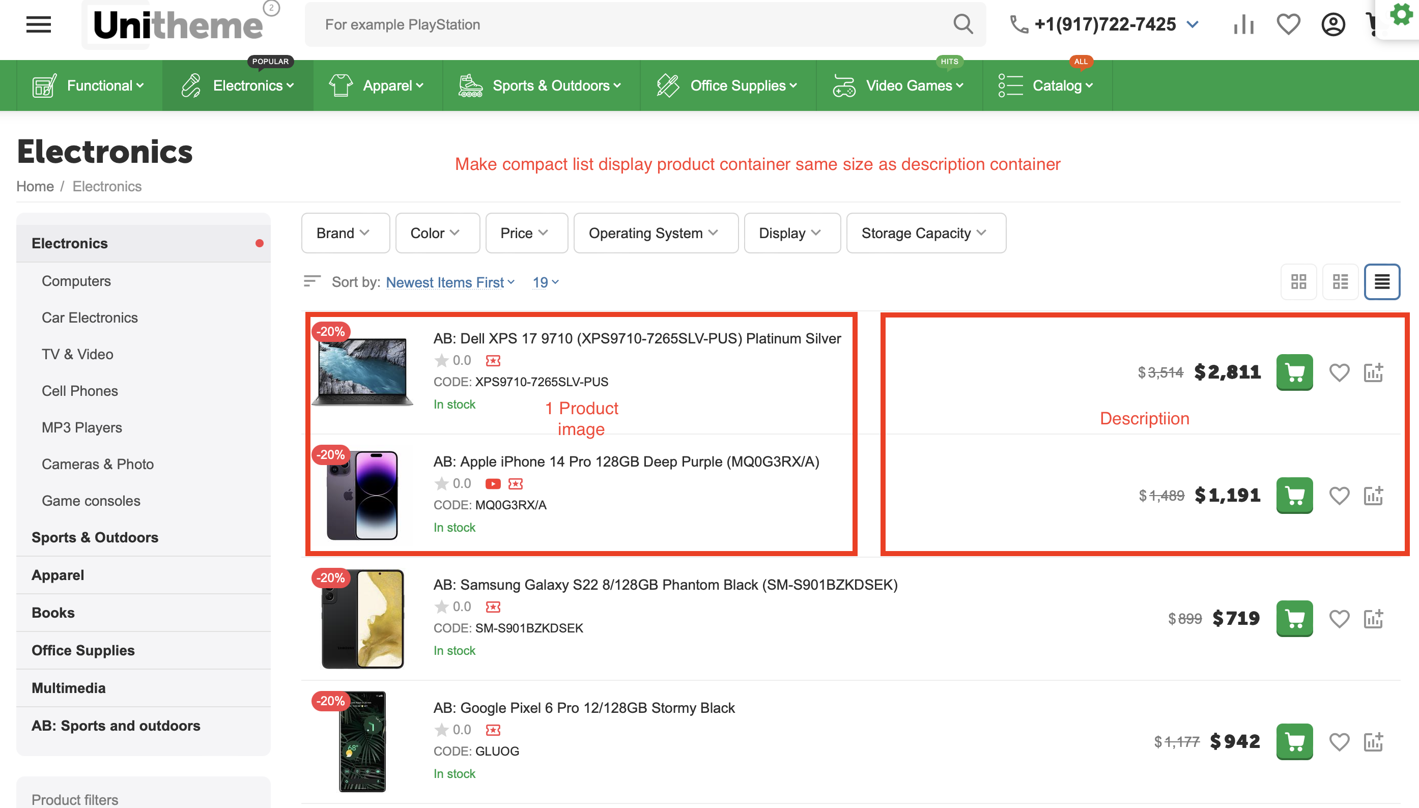
Personally I would like some improvement on the compact list view so that both the product container and its description are the same size, or at least close. Right now the product image container is tiny especially on the desktop and it doesn't make sense. I would like the image of the product to have an equal container size as its description. If not equal at least 40/60 where the description container gets 60%. And then showcase a bit more info in the description container such as free shipping etc. See attached screenshot