

Undercover
-
Постов
54 -
Зарегистрирован
-
Посещение
-
Победитель дней
2
Сообщения, опубликованные Undercover
-
-
@ab.support.serjI've tested it out and it works just fine.
Thanks for pointing that out.
-
@ab.support.serjI was going to do that but wasn’t sure if the icon will be resized automatically to the size of the other motivation block system icons enabled from stickers backend. Can you confirm if the icon uploaded as an image will automatically be resized?
-
The hide content to needed hide doesn't always work the first time you visit a page with more content, for example a long product description. The feature works only when you reload the page again.
-
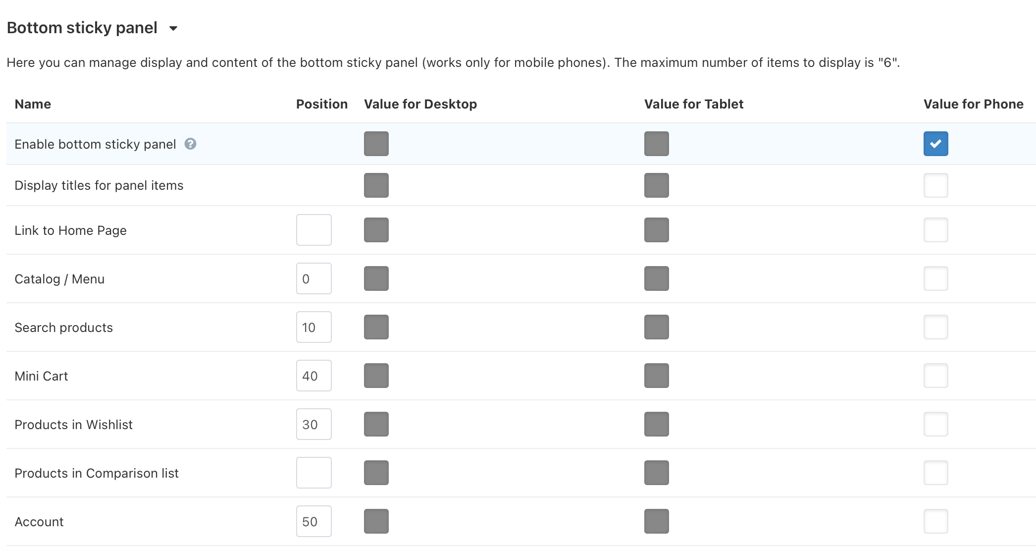
@ab.support.serj I do not want to disable the top sticky panel. From my observation the bottom sticky panel now works like this, if enabled then it will display the original sticky "Buy" button when on a product page. And now you have options to check 6 additional new bottom sticky menus. I want to disable these additional bottom sticky menus and leave only the original "Buy" button that pops up when viewing a product.
-
Its nice that UniTheme comes with icons we can use,, however, I would like to upload my own custom created icon so use on the "Motivation Block". I made the icon in the style of the default icons and I would like help with directions on how I can put it to use.
Many thanks.
-
@ab.support.serj That's because that's the only way to use the old and loved sticky add to cart now. Before these new stick panel menus came the sticky add to cart had always been there without any empty space.
-
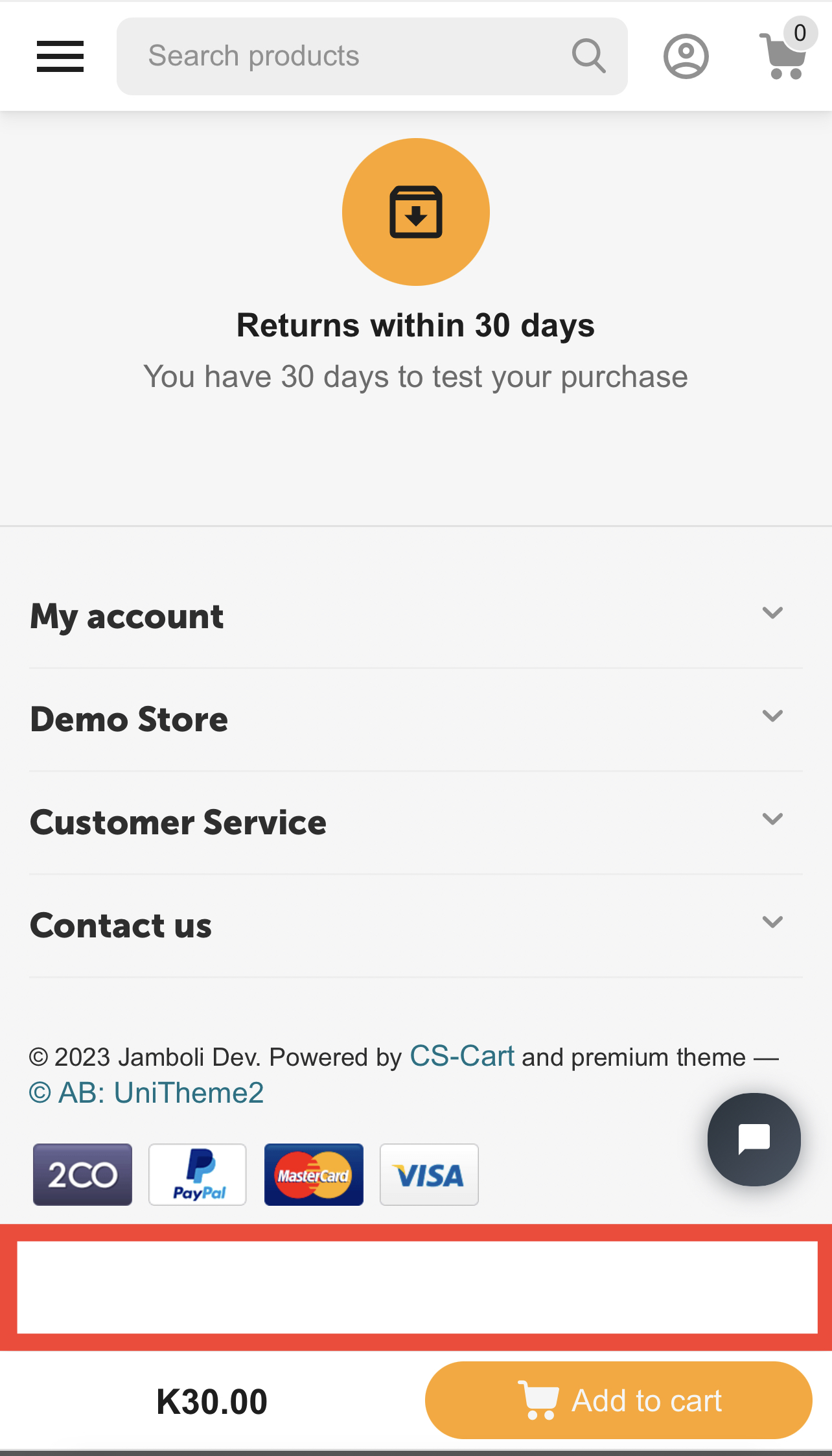
I have enabled the "Bottom sticky panel" so I can show a sticky add to cart.
But I have not checked other stick menus, then the bottom of the page on mobile is leaving a huge gap of empty space. See attached screenshot.
How can I prevent the empty white space showing up?

-
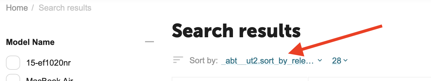
I cant seem to find the translation for this sort filter, "_abt__ut2.sort_by_relevance_asc".
I am unable to edit it on the theme nor am I able to find its translation when editing from the admin area.
This is what I see when I search for products.
-
I want to create an FAQ page using UniTheme's system CSS styles. Can someone help provide CSS and sample HTML questions using UniTheme's styles.
Your help is appreciated.
-
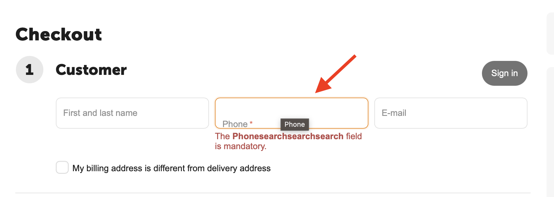
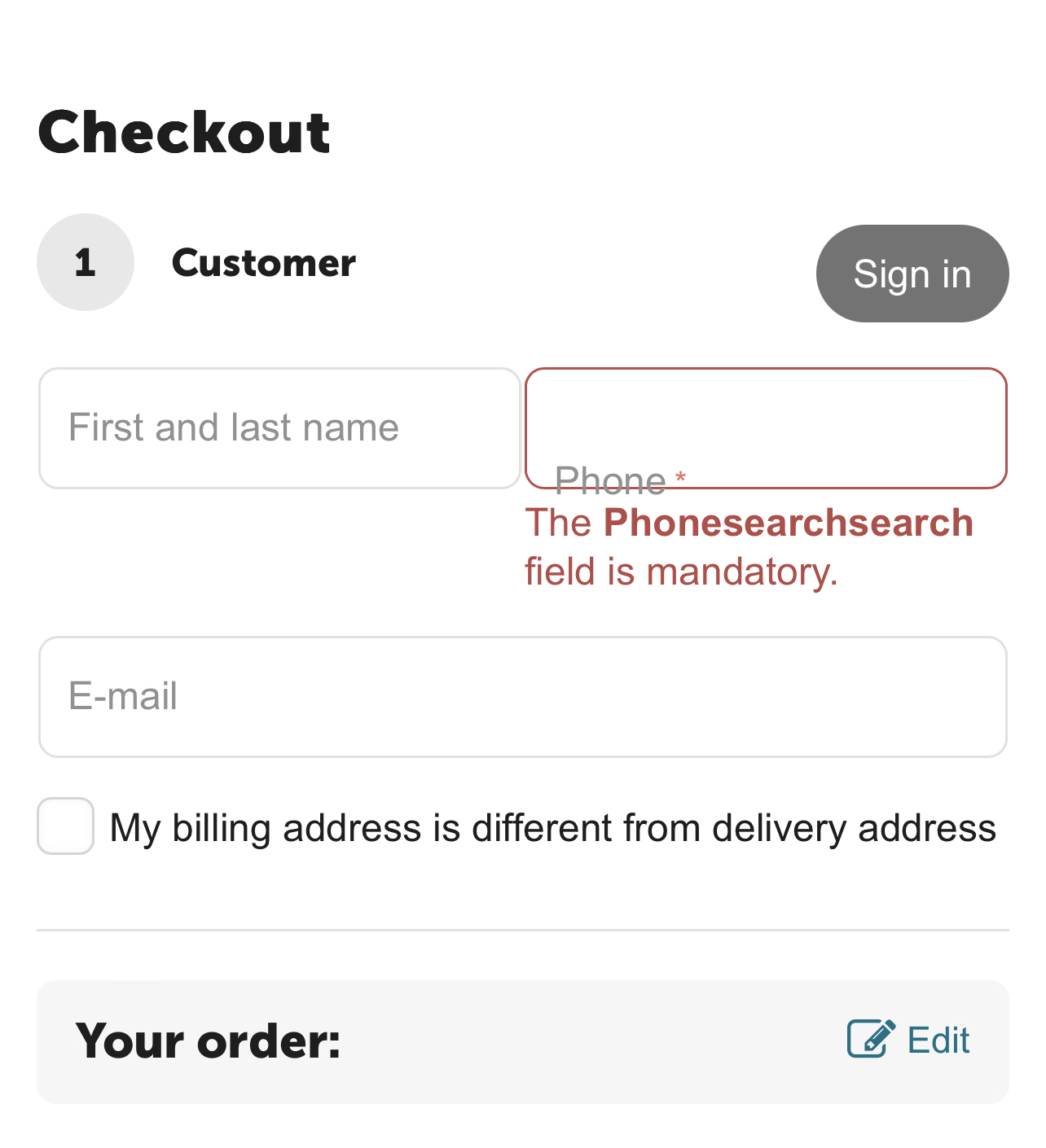
@ab.support.serj This is what happens when i try to edit the field using the theme text editor as shown in your screenshot. All fields end up being the same.
-
@ab.support.serj @ab.support.serjAlso look at the alignment of the phone field? its lower than the email field, that another major concern.
This happens when i set the default text to display the actual field.
-
@ab.support.serj @ab.support.serjEverything becomes a phone field when I change that text using text editor online.

-
The countdown on the promotion does not end, it restarts itself and disregards the set ending date. Also the "Promotion period" date is not synced with the countdown. The period date would say 2 days while the countdown says 2 hours and the actual period date says 1/04/2023.
-
@ab.support.serj The solution in that discussion did not help.
-
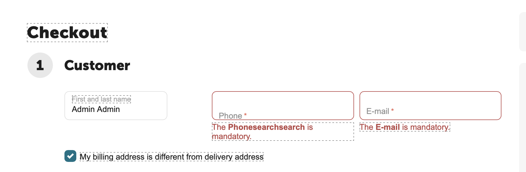
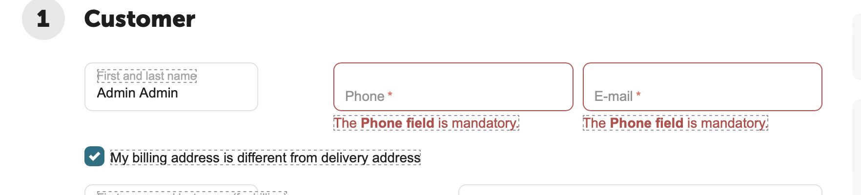
When you click on on "Place order" and don't specify the mandatory email or phone information, the error message is shown in a strange way. See attached images. This was noticed on both Unitheme 4.16.1 c as well as on d.
-
@ab.support.serj On the latest version of Safari on iPhone 13 Pro Max running iOS 16.3 .
-
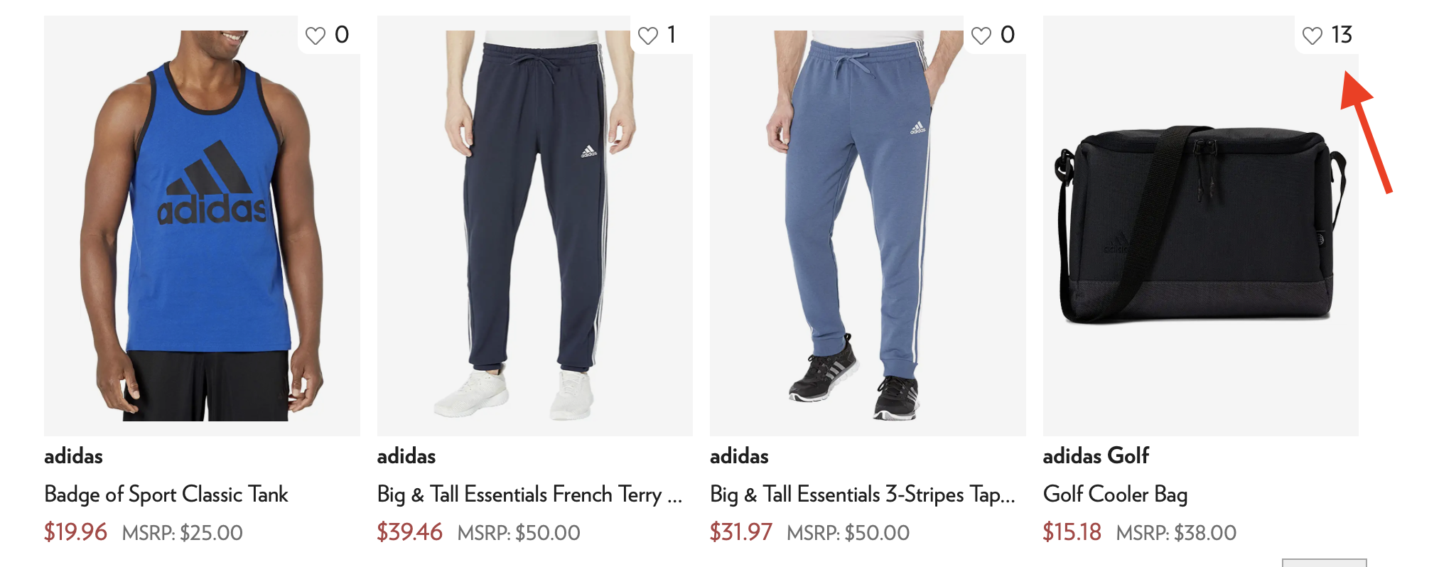
Было бы здорово, если бы вы добавили счётчики рядом с соответствующими иконками "Добавить в список сравнения" и "Добавить в список отложенных товаров". Почему? Это побуждает покупателей купить товар, зная, что многие клиенты добавили его в свой список желаний, так как это показывает, что товар пользуется популярностью.
Это мелочь, но она психологически подталкивает к необходимости скорее купить товар или к душевному спокойствию, зная, что вы покупаете что-то, что другие люди считают хорошим.
-
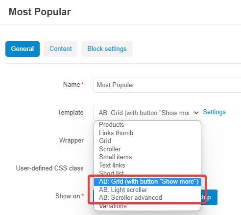
Добавьте возможность выводить доп. информацию о товаре (например, характеристики) в AB: скроллерах - сейчас это возможно только для списков товаров.
-
It would be cool if you could add a wish list counter right next to the heart icon. Why? It encourages customers to buy the product knowing a lot of customers added it to their wish list as it shows the product is popular.
It's a small thing, but it psychologically pushes the urgency to buy sooner or to have peace of mind knowing you are buying something other people think its nice.
-
Please do something about the social sharing feature. If a user is on mobile, don't' show social icons, instead simply show a share icon. When tapped on it, open the user's mobile apps to share the product directly to that social app while capturing the name and image of the product. This is more convenient and encourages sharing. Also this is what most websites do nowadays.
-
This update is catching up to the trends and I appreciate your hard work. I would like the the scroll transition to be smoother and fluid. You want to swipe and watch the elements slide smoothly and stop nicely in time as one would expect. Right now the swipe transition is slightly rough almost laggy kind of feeling.
-
Add the ability to show feature variants in the AB: light scroller and grid views (currently its only shown on default grid view). Instead of showing the feature name example, "Storage.........8GB" just show 8GB on mobile. See screenshot for illustration.
-
@ab.support.serj Not sure why i cant see the bug on your demo. Perhaps its because your demo's similar products uses a different 3 multiple blocks style.
-
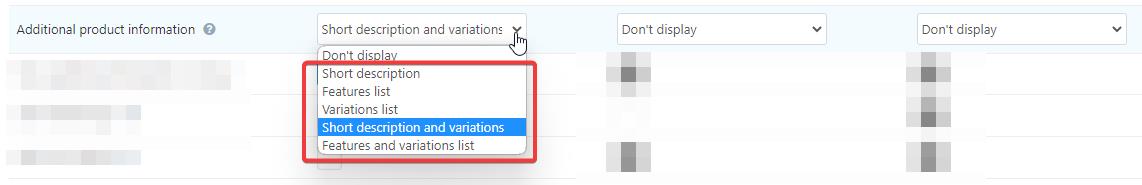
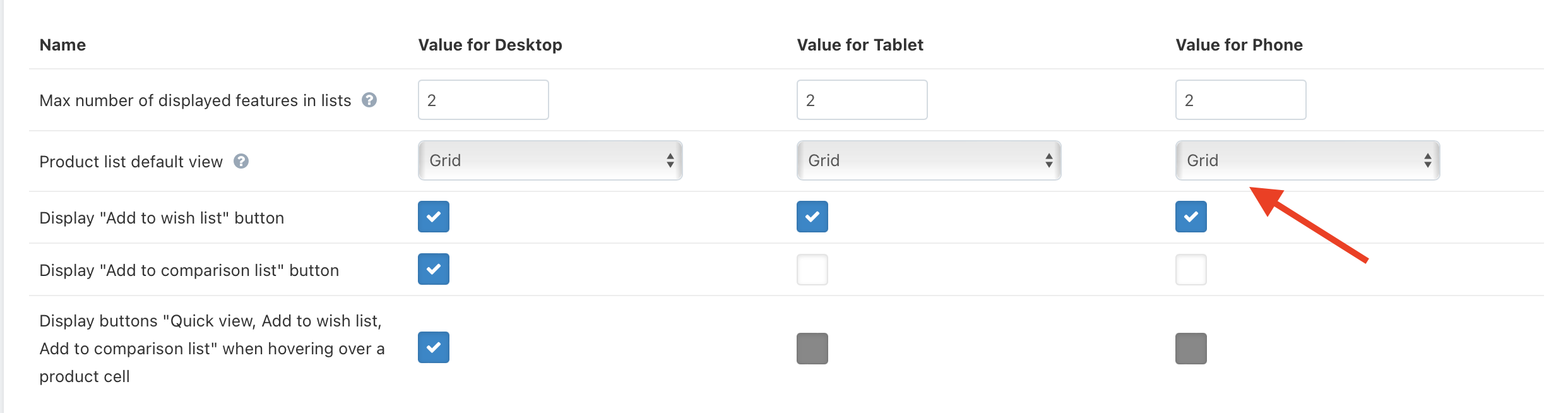
In the theme setting, there is an option to show features on the product list, and by default the number is 2 and is shown on grid view correctly. Can you add this to be shown on other views such as light grid as well? Also, find a way to implement the features to only show the variants without the name of the feature especially on mobile. Example, the name is "Storage: .........8GB", when displaying this in the product list view, you can only display the "8GB" variant.
-
 1
1
-


Bottom sticky menus issue
в UniTheme2 - адаптивный премиум шаблон для CS-Cart и Multi-Vendor
Опубликовано
@ab.support.serjIve disabled the 6 bottom sticky menus. I will just have to deal with the empty space because I don’t want those menus it’s too many icons especially with my live chat floating around.